

If you’re looking to add green to your home’s interior but don’t know where to apply it or which shade to select, watch the video or continue reading for inspiration!
We use green in many of our clients’ designs because it’s such a versatile color with a fabulous range – everything from calm and soothing hues to bold and dramatic shades. Green can create an earthy and natural look, add a refreshing feel, or make a striking statement. And green pairs so well with whites, creams, and natural wood tones. Today’s popular green shades run from soft, leafy-tinted tones to deep, almost black tones, and we’ve used them all in our recent designs.
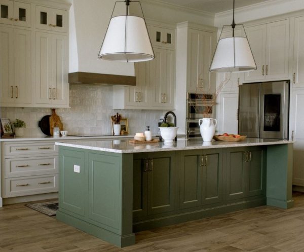
We designed this kitchen with white perimeter cabinetry and wood accents – both are perfectly suited to the eucalyptus green on the island cabinets. The soft green was chosen to break up the white and complement the warm wood features in this lakefront home’s kitchen. Adding a green like this really gives character to your space. 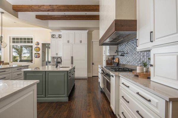
Sherwin Williams: Rocky River
Considering adding a bit of drama to your home? An emerald green might be just the answer. Take a look at the bar in our showroom that features a deep, jewel-toned green. Vogue Green by Sherwin Williams is a true green that won’t ever be mistaken for a blue or a gray. This shade is perfect when you want bold but don’t want to go too dark. It’s rich, timeless, and makes a statement.
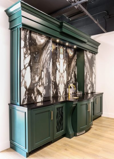
Sherwin Williams: Vogue Green
If you’re looking to create a moody feel with a deep, saturated shade, Black Forest by Benjamin Moore is an outstanding option. It’s one of the richest and darkest shades of green that Benjamin Moore offers. and it can create a dramatic and luxurious look in your home. We’re currently designing a kitchen for clients where we chose Black Forest for the perimeter cabinetry as a contrast to the light wood cabinetry of the double islands. You can see how Black Forest adds richness and depth in contrast to the lighter finishes in the space.
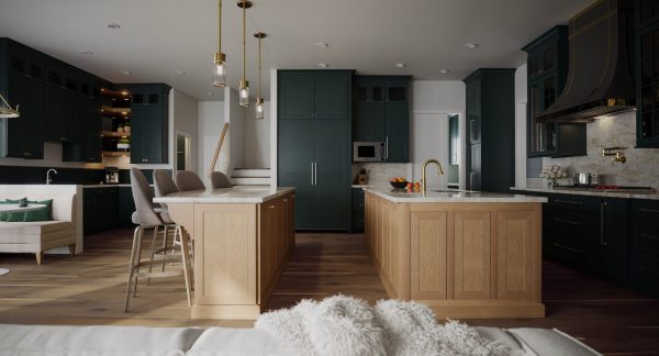
Bejamin Moore: Black Forest
Interested in a more organic and earthy look? Here’s a kitchen we designed that provides just that! We chose Sherwin Williams Rosemary for this massive kitchen island. This hue is a darker-toned sage green. Its gray undertones give it a cool and soothing tone, but it’s also deep enough to make a gorgeous statement in your home.
Sherwin Williams: Rosemary
Are you inspired to add green to your interiors? Stay tuned for Part II of our green paint shade recommendations where we show you more shades and how we used them in our clients’ homes!